
Blog
Coloring Techniques for Beginners & Advanced Artists
Hello and welcome to the magical world of coloring! I’m Prajakta, the artist behind Different Strokes Arts. Whether you’re picking up a coloring pencil for the first time or you’re an experienced artist looking to refine your skills, there’s always something new and exciting to discover. Coloring isn’t just an activity; it’s a journey into creativity, relaxation, and self-expression. So, grab your favorite coloring tools and join me as we explore some delightful techniques that will bring your artwork to life.
Starting Out: The Joy of Simple Beginnings
Do you remember the first time you colored as a child? The joy of selecting your favorite crayon and filling a blank space with vibrant hues? That sense of wonder is something we can all reconnect with, no matter our age.
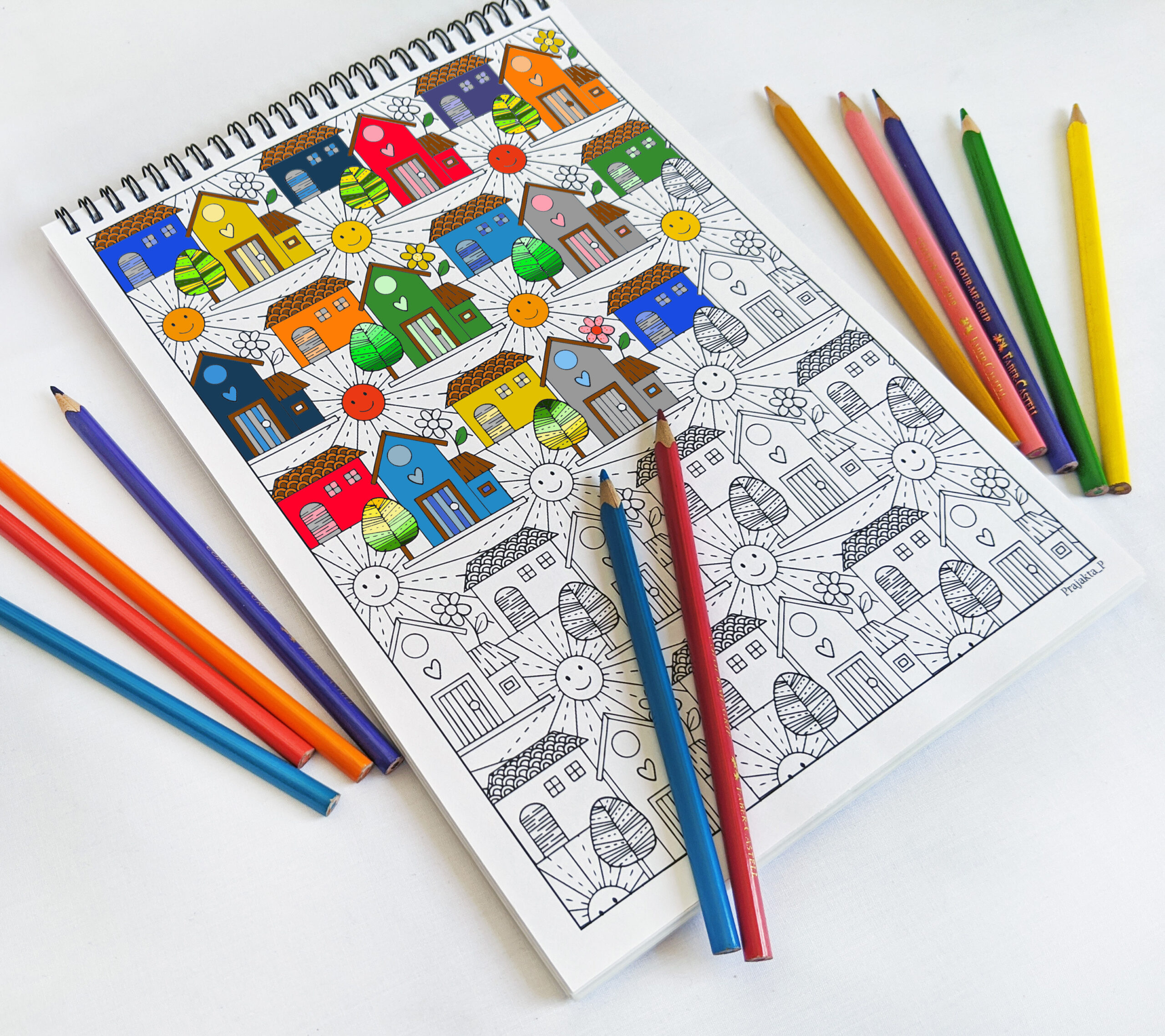
Choosing Your Tools:
When I first started, choosing the right tools made a big difference in my coloring experience. Colored pencils offer control and precision, perfect for the intricate details in our coloring books and postcards. Markers provide bold, smooth color that covers large areas effortlessly, and let’s not forget the humble crayon, which brings back nostalgic memories.
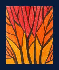
Embracing Basic Shading:
Shading is like adding dimension to your flat world. When I started shading, I found flat shading to be the perfect first step. Just color in a consistent direction, like painting a fence. Then, try gradient shading. Imagine a sunset: start with heavy pressure and gradually lighten it up. This creates a beautiful transition from dark to light, just like the sky at dusk.
Example:
Notice how the gradient shading on the left transitions smoothly from dark to light, adding depth.
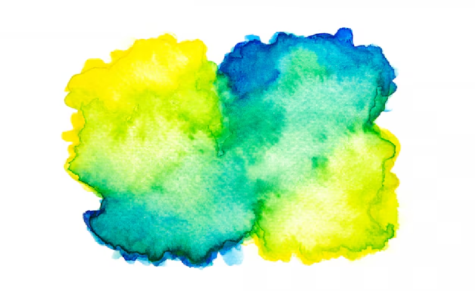
Discovering Blending:
Blending two colors together feels like mixing different emotions on a canvas. I love choosing two colors and blending them where they meet using small, circular motions. It’s like blending ingredients in a recipe, creating a seamless, harmonious flavor.
Example:
In this example, see how the blue and yellow blend together to form a green in the middle, creating a smooth transition.
Growing Your Skills: Adding Depth and Texture
As you grow more comfortable, it’s time to explore deeper, more textured worlds. Think of it as upgrading from a cozy neighborhood walk to an adventurous hike through a forest.
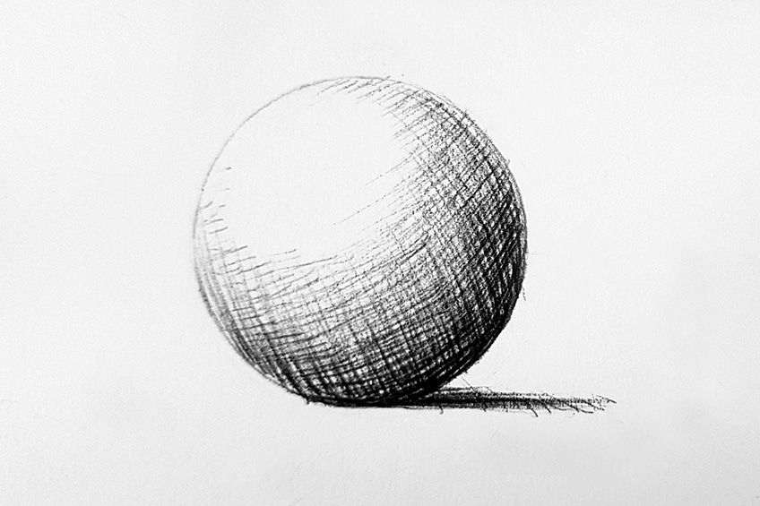
Advanced Shading and Lighting:
When I became more comfortable with basic techniques, I started thinking about light sources and shadows in my scenes. Where is the light coming from? Picture the sun casting shadows and highlights. Adding these to your drawings gives them a realistic, three-dimensional effect, like bringing your artwork to life.
Example:
The light source from the top left creates shadows and highlights, making the sphere appear three-dimensional.
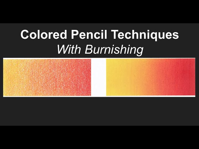
Mastering Blending Techniques:
For those ready to take blending up a notch, burnishing is a wonderful technique I often use. Using a colorless blender or a light-colored pencil to press down hard and smooth out colors eliminates any graininess. It’s like giving your artwork a professional polish.
Example:
See how burnishing with a light pencil smooths out the colors, creating a polished finish.
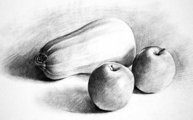
Creating Realistic Textures: Textures add a tactile feel to your art. For example, to mimic the soft fur of a kitten, use short, fine strokes. For the rough bark of a tree, try using hatching (parallel lines) or stippling (tiny dots). These techniques make your coloring more lifelike and engaging.
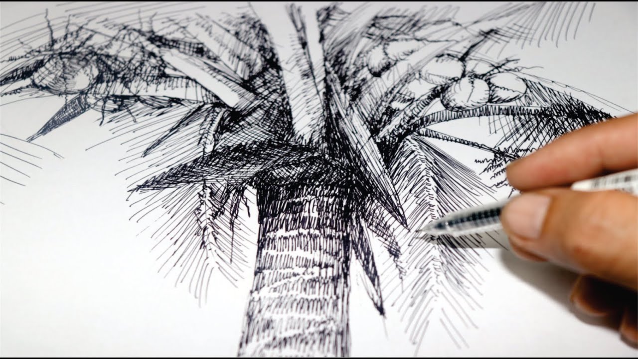
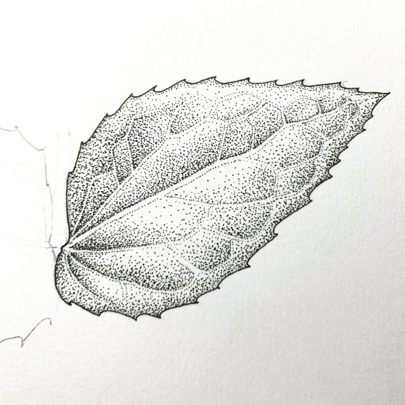
Example:
Different textures created with hatching and stippling give a realistic feel to the tree bark and leaves.
The Artist’s Touch: Bringing It All Together
No matter where you are on your coloring journey, the key is to enjoy the process. Each stroke of color is a step on a path that’s uniquely yours.
Color Harmony and Composition:
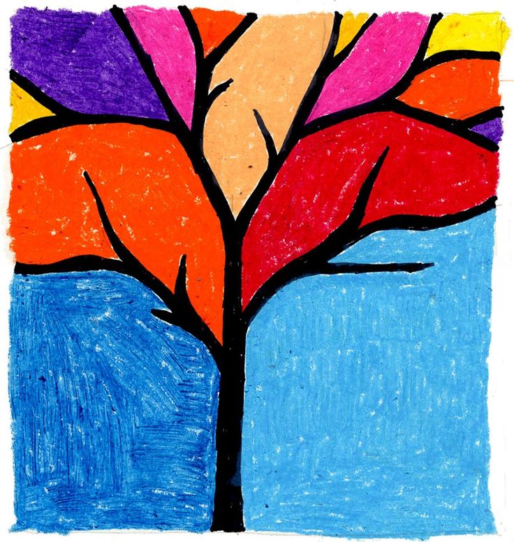
Understanding color harmony can make your artwork visually appealing. I often experiment with complementary colors (opposites on the color wheel) to create vibrant contrast, or analogous colors (next to each other) for a soothing blend. It’s like orchestrating a symphony of colors on your page.
Example:
Complementary colors create a striking effect, while analogous colors provide harmony and balance.
Depth and Perspective:
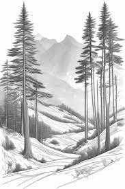
Adding depth to your artwork transforms it from flat to fabulous. Use lighter colors and less detail for distant objects, and darker, more detailed work for closer ones. This technique is like looking through a window into another world.
Example:
Notice how the lighter, less detailed mountains in the background contrast with the darker, detailed foreground, adding depth to the scene.
Connecting with Your Creative Side
At Different Strokes Arts, I believe coloring is a personal journey that connects you with your inner artist. Whether you’re using our coloring books, canvases, or postcards, each piece you create is a reflection of your unique style and vision.
Remember, there’s no right or wrong way to color. It’s all about expressing yourself and finding joy in the process. So, next time you sit down with your coloring tools, take a moment to appreciate the journey. Let each color you choose be a step towards discovering something new about yourself.
Happy coloring, and may your artistic journey be as vibrant and beautiful as the colors on your page.
Warm regards,
Prajakta
 Coloring Books